+30%
Increase in social media traffic
+15%
Increase in service bookings
100%
SEO visibility for branded searches
6
Days from approval to production launch
Portfolio update
Work in progress
Please note that some case studies are still being refined, but here's a sneak peek.
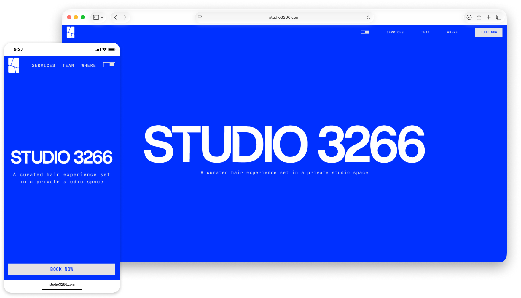
Minimal website for a private hair studio in Manchester.
STUDIO3266 is a website I designed and developed for a private hair studio based in Manchester. The goal was to create a minimal, high-impact digital presence that reflects the studio’s identity while guiding users quickly toward booking a service.
Built with Nuxt 4, Tailwind CSS, Lenis, and GSAP, the project focuses on performance, accessibility, and SEO best practices while maintaining a clean and distraction-free interface.
+30%
Increase in social media traffic
+15%
Increase in service bookings
100%
SEO visibility for branded searches
6
Days from approval to production launch
Client
STUDIO3266
Work Type
Freelancer
Industry
Private Hair Studio / Service Business
Role
UI/UX Designer / Front-End Developer / SEO / Accessibility / Launch & Domain Setup
Scope
UX Structure / Visual Design / Nuxt Front-End / Motion / SEO / Accessibility
Core Stack
Nuxt 3 / Vue.js / Tailwind CSS
Tools
Figma / GSAP
Duration
2026 (3 weeks)
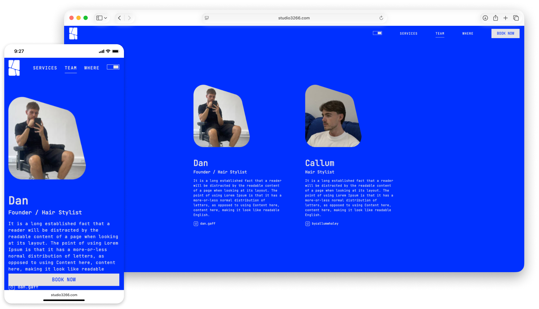
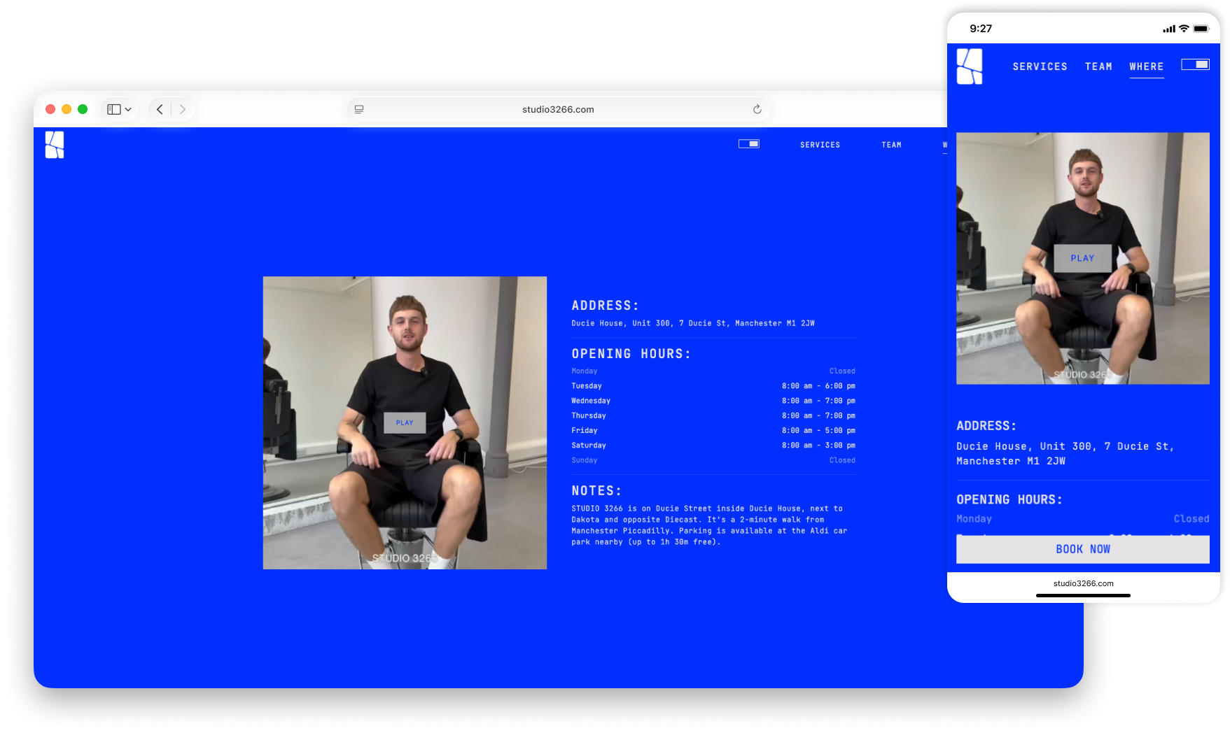
STUDIO3266 translates the studio’s minimal identity into a clean digital experience where services, team, location, and booking are easy to scan without visual clutter.
A focused one-page website with strong hierarchy, dual-theme styling, and one clear booking path.
A single booking path keeps the journey focused: users move from brand and service content into Fresha without duplicate forms or competing actions.
The studio needed a site that felt private, premium, and distinctive, while still making services understandable and booking immediate. The risk was building something visually restrained but unclear, or functional but too generic for the brand.
Translate a strong offline identity into a minimal website that still converts.
The brand direction was already strong, so the real UX work was structural: reduce choices, clarify services, and let one booking action carry the whole journey without clutter.
The clearest insight was that focus mattered more than feature depth.
I handled UX structure, visual design, prototyping, and front-end development end to end. Small Figma variants helped align with the client quickly and reduced iteration during implementation.
A lightweight design-to-build workflow kept approval and delivery fast.
Typography, spacing, motion, and CTA placement were used to keep the site minimal while still making services and booking feel clear.
The final interface relies on a few deliberate UX decisions rather than many features.
Booking CTA
The primary action stays visible and isolated so users always know how to book.
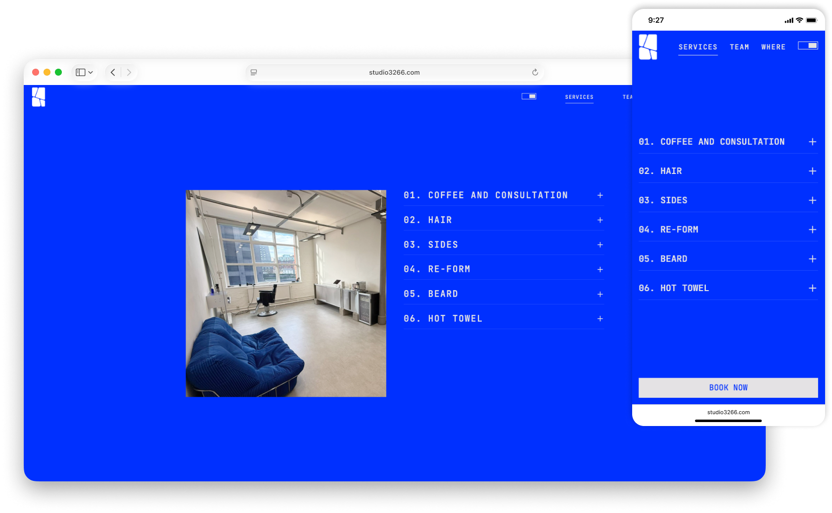
Service Hierarchy
Services are grouped in a simple numbered list that keeps scanning fast and visually calm.
Expanded Service Detail
The open state explains one service clearly without pushing users into a separate page.
Book Now
Navigation remains lightweight while keeping the conversion path visible at all times.
Service Image
Photography adds personality and trust without breaking the minimal layout system.
Service List
Service details and booking cues are kept together so the page stays informative but direct.