60+
Reusable design-system components
100+
Prototype and workflow screens
-60%
Manual reporting loop time
5M+
Daily records handled
Portfolio update
Work in progress
Please note that some case studies are still being refined, but here's a sneak peek.
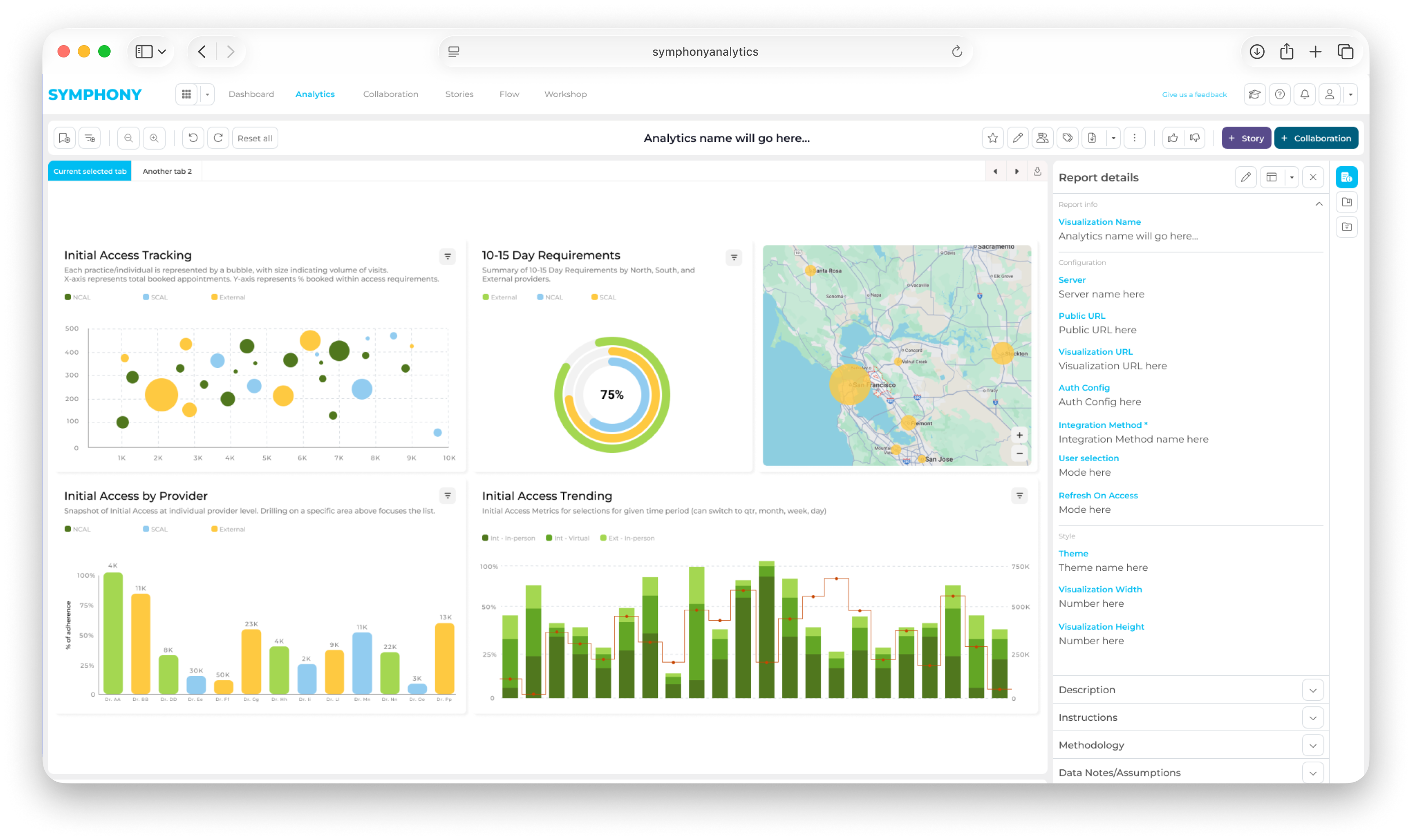
Unified enterprise analytics workspace for investigation, collaboration, and reporting.
Symphony is an enterprise analytics workspace built on top of tools such as Power BI and Tableau. I led UX/UI strategy and implemented key Vue front-end experiences for investigation, collaboration, and reporting workflows.
The goal was to keep teams inside one connected workflow, using saved views, in-context collaboration, and storytelling to reduce screenshot handoffs and manual reporting loops.
60+
Reusable design-system components
100+
Prototype and workflow screens
-60%
Manual reporting loop time
5M+
Daily records handled
Company
Berkeley Research Group (BRG)
Work Type
Full-time Employee
Industry
Enterprise Analytics / B2B SaaS
Sectors
Finance / Government / Healthcare
Role
Lead UX/UI Designer / Front-End Developer / Product Designer
Scope
UX Strategy / Design System / Vue Front-End
Core Stack
Vue.js / Tailwind CSS / Bootstrap CSS / JavaScript
Tools
Figma / ECharts / Power BI / Tableau
Duration
2019-2025
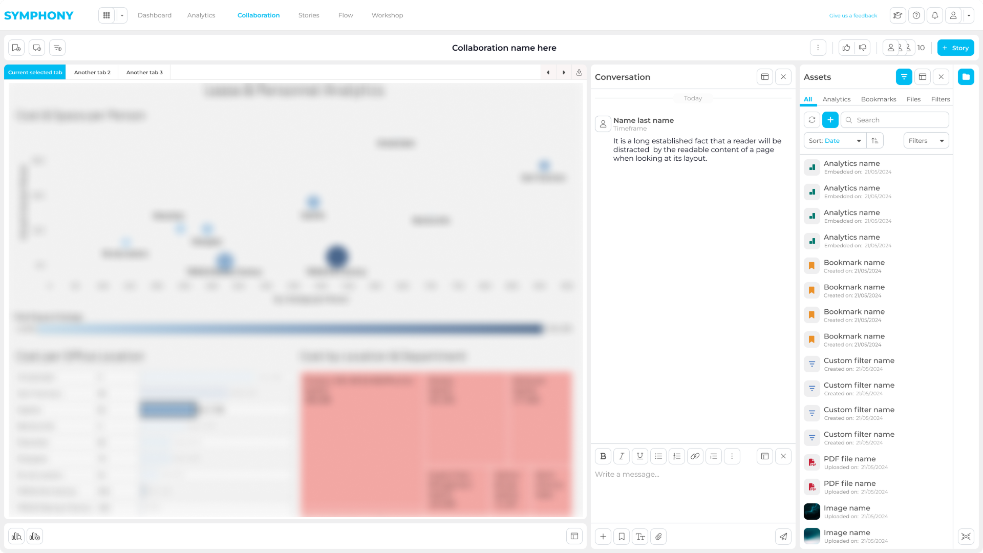
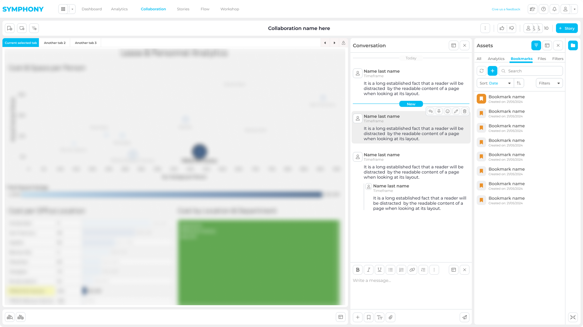
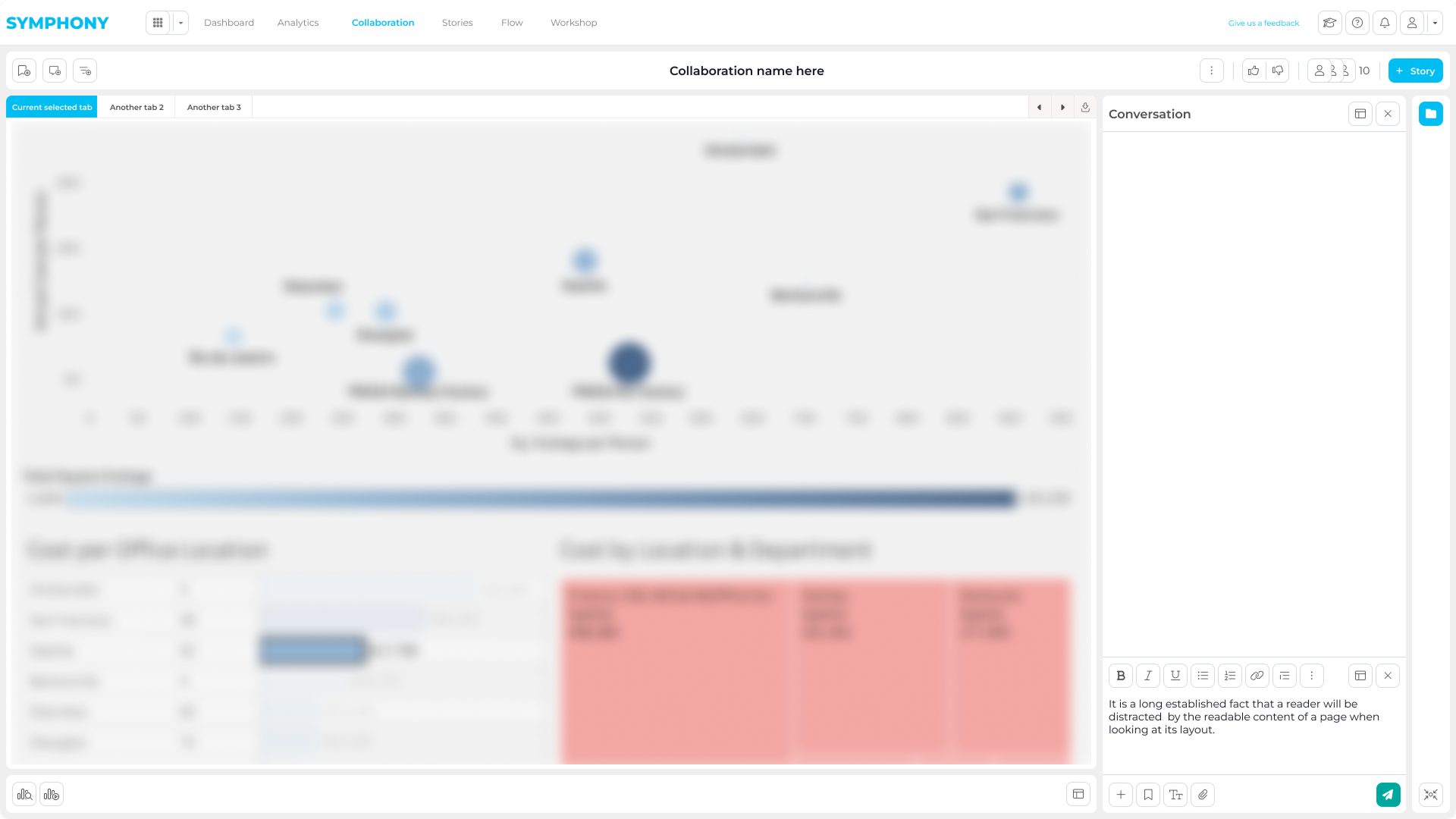
Symphony connected embedded analytics, bookmarks, collaboration, and storytelling so teams could move from insight to output without losing context.
A unified layer for analytics, collaboration, and reporting on top of existing BI tools.
Symphony sits on top of existing analytics tools, giving teams one workspace to access dashboards, save views, and keep investigation context visible across review.
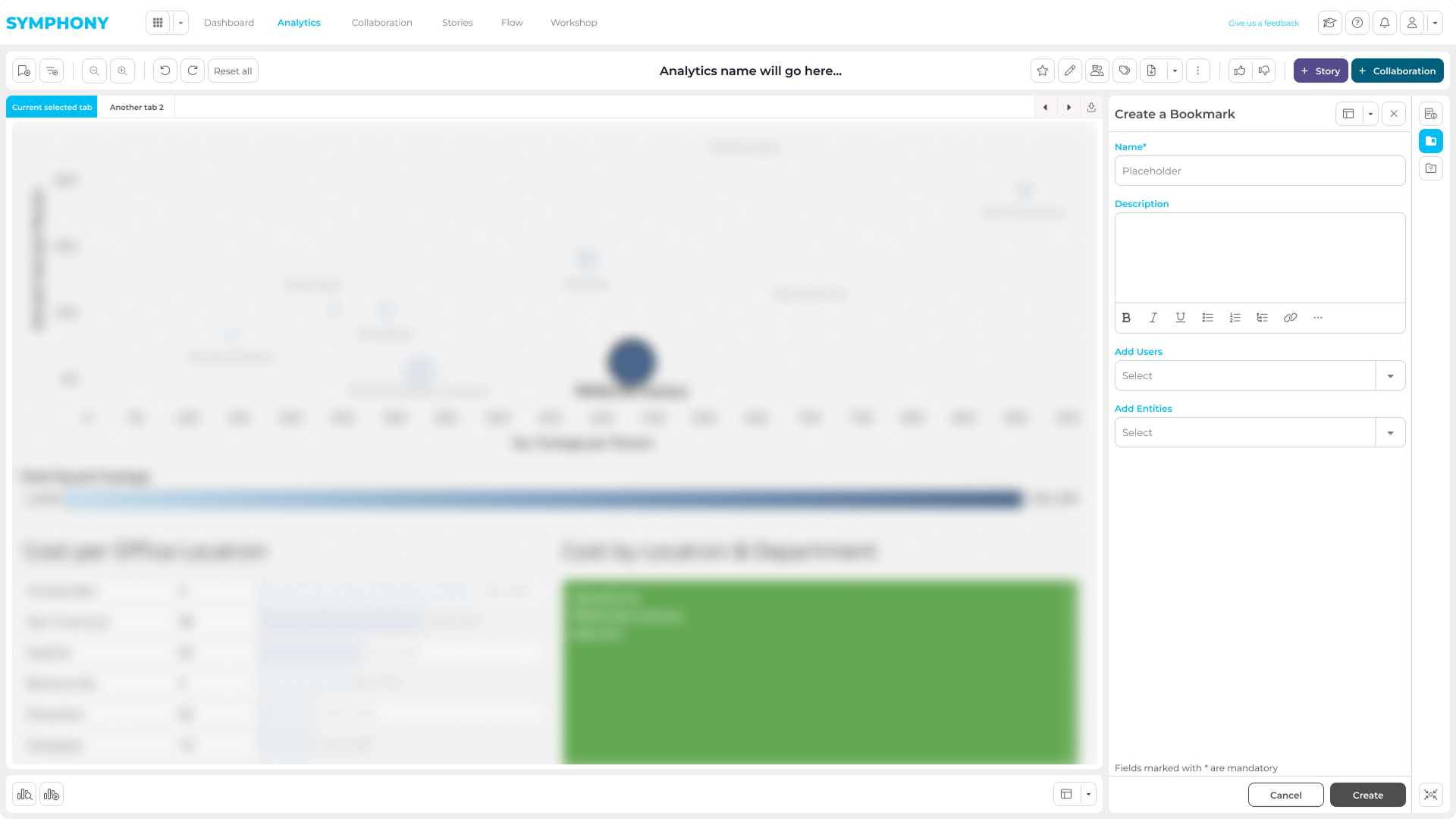
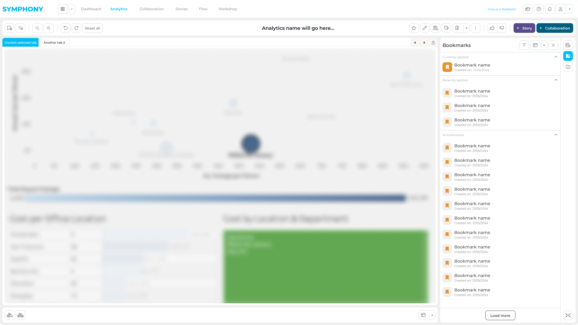
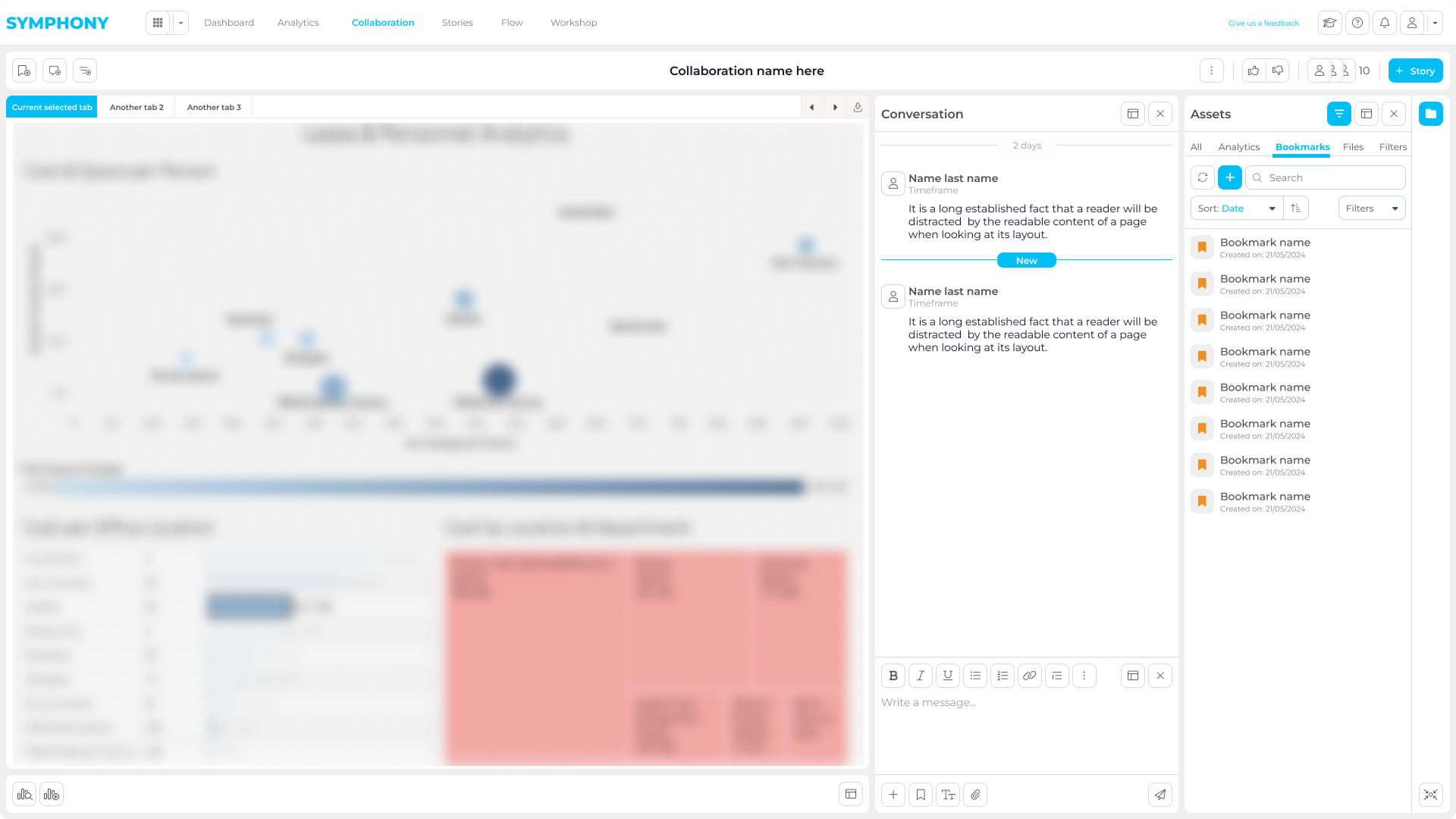
Collaboration stays in context: saved assets, shared states, and feedback remain attached to live analytics instead of moving into screenshots or email threads.
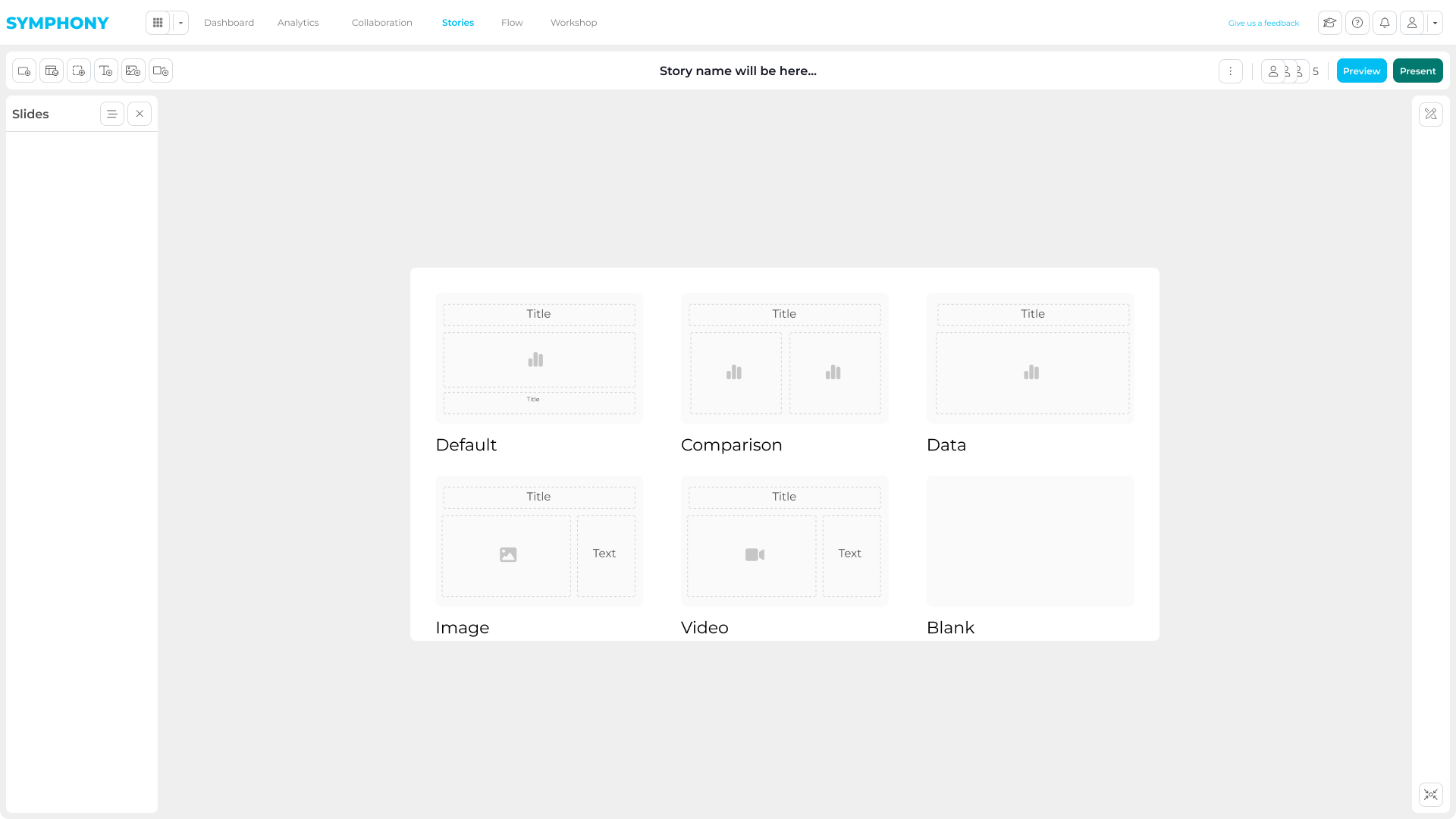
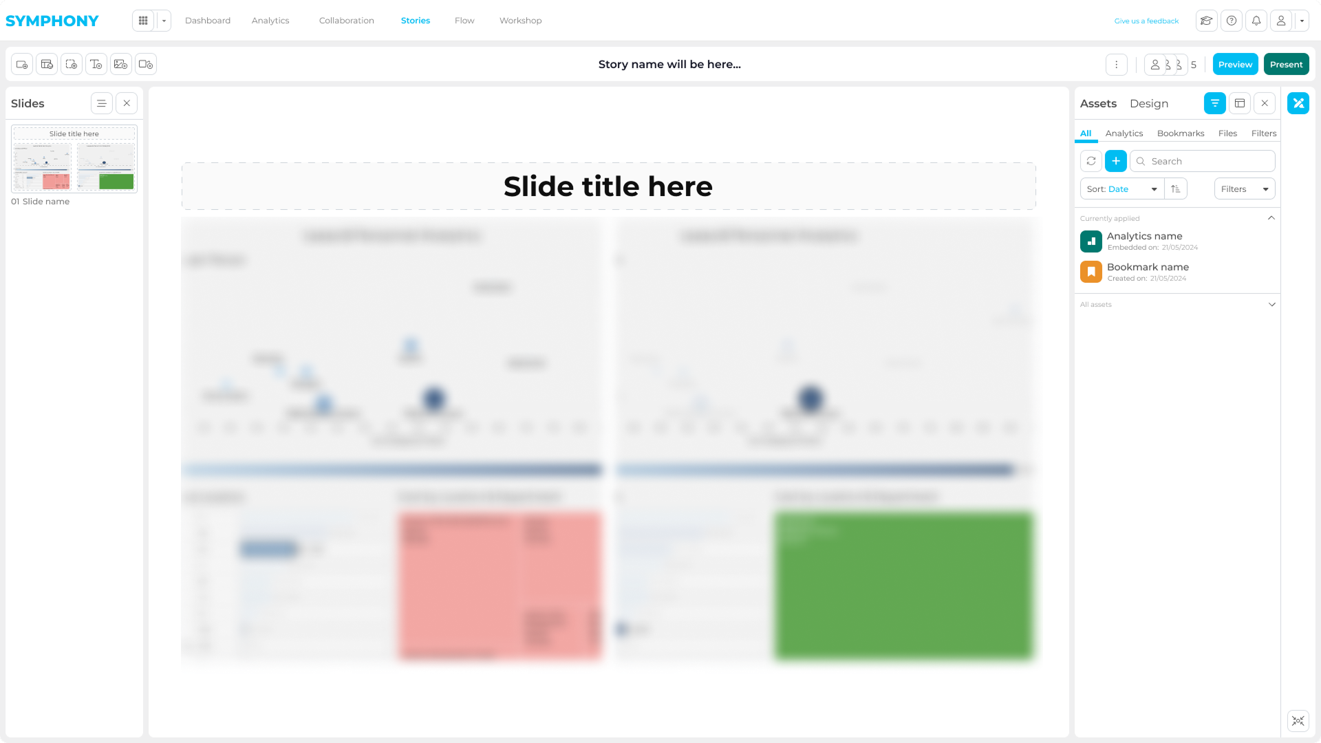
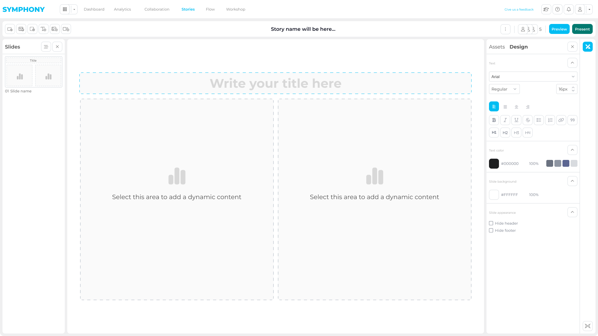
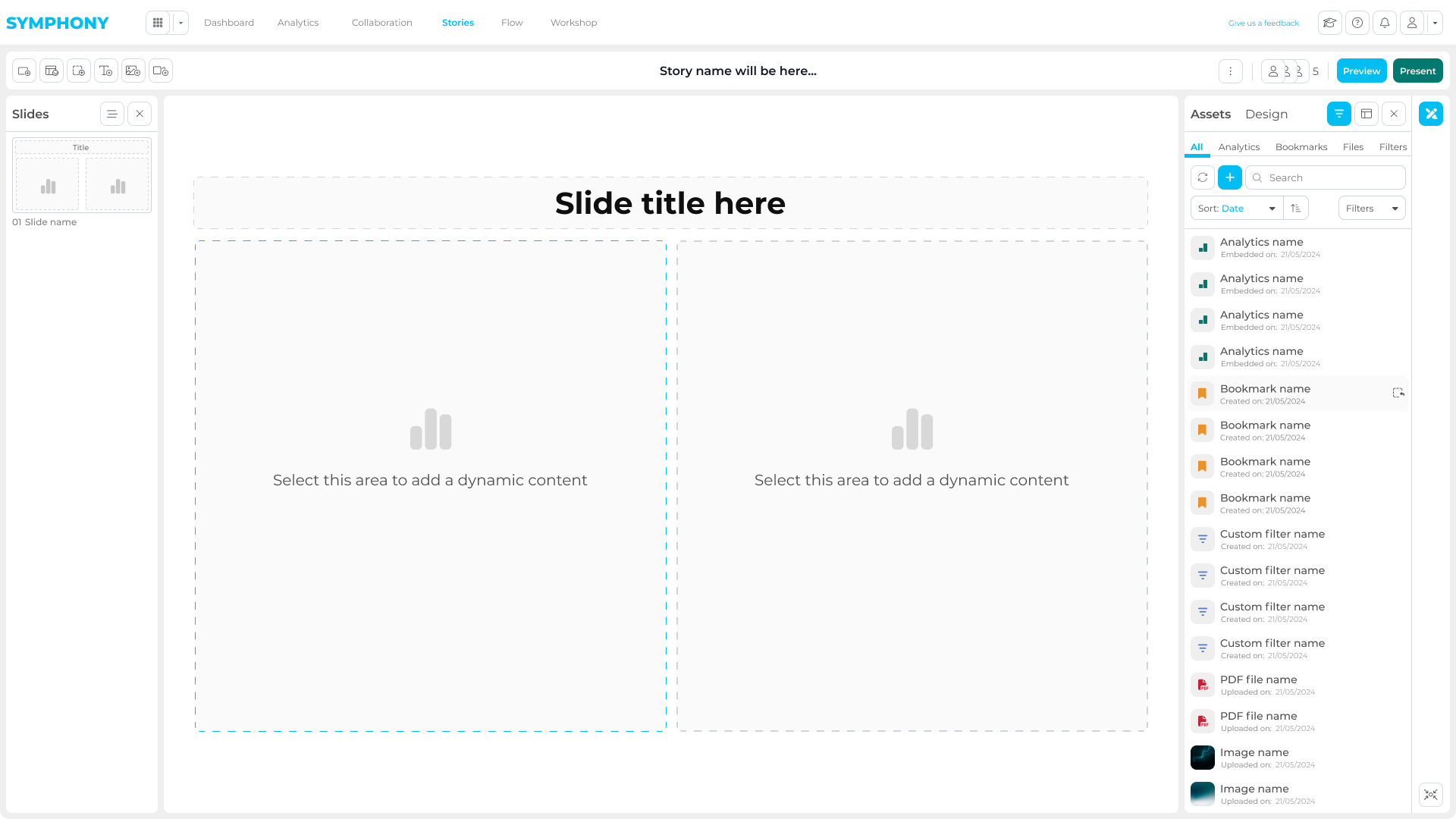
The story workflow turns analysis into client-ready outputs, letting teams select assets, shape narrative, and prepare delivery without leaving the product.
Once an insight mattered, teams left analytics tools and moved into screenshots, decks, and email threads. That broke context, slowed review, and created rework across builders, leaders, and decision-makers.
The dashboard was not the problem; the handoff after it was.
Across sectors, teams already had tools such as Power BI and Tableau. The missing layer was how builders, leaders, analysts, and decision-makers shared, reviewed, and delivered insights without leaving context.
Research showed the real gap was collaboration after insight discovery.
The work started with the steps around an insight: access, save, discuss, refine, and deliver. From there I moved into wireframes, prototypes, and reusable UI patterns, validating critical flows before implementation.
I mapped the workflow around analytics before designing screens.
A top-layer workflow map defined the platform’s overall journey from access to delivery.
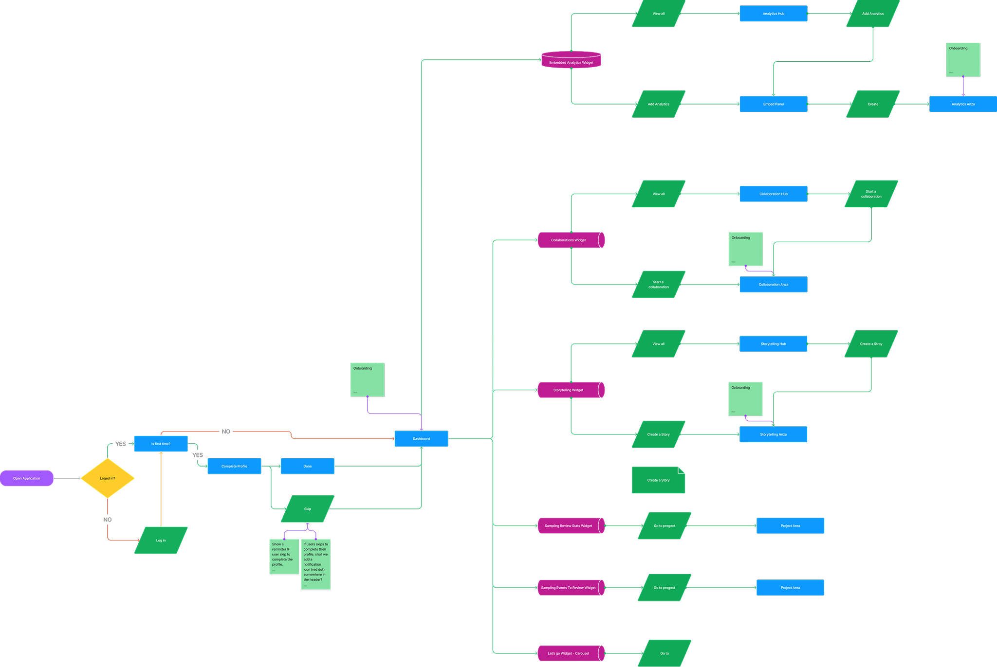
The goal was to define a scalable product structure that could support Embedded Analytics, Collaboration, and Story without treating them as separate environments.

This slot should show how repeated interactions were turned into reusable UI patterns across analytics, collaboration, and storytelling modules.

Instead of optimizing single screens in isolation, Symphony focused on keeping investigation state, collaboration, and reporting connected. That made the product more usable for teams and more scalable for delivery.
The strongest product choices were the ones that protected context across the whole workflow.